Life

Blue and red can have too much of an effect on those in the room.


When choosing in what color to paint the walls, we are often guided mainly by considerations of whether we like the shade or not. But experienced designers say that it can affect not only visual perception, but also the emotional state of the occupants of the house, their mental well-being. So recently they have spread the concept of a "happy room", the appearance of which will cause pleasant emotions, both for owners and tenants.
Homes and Gardens found out that certain colors are almost never found in the design of "happy rooms". And explained exactly why.
Watch out for red
Not without reason this color is called the color of passion - it too intensely affects the emotional state. Red is also associated with danger and anger. In the most sensitive people it can cause a "hit or run" reaction, usually arising in response to a threat, and also trigger manifestations of stress - increased heart rate, increased body temperature, aggravation of perception of external signals.
How to play red in the interior? At the same time, this color represents love, strength and motivation, awakens sensuality. Some researchers say that it helps in the production of melatonin and can improve memory. Therefore, it can be used as an accent color. The main nuance is not to "fill" too much of the space with red. And before choosing a shade, determine exactly what feelings it evokes in you.
Yellow and its influence on emotional reactions
The decorative potential of sunshine yellow is very great, but it can overly aggravate the senses. Specialists in coloristics even call it the strongest color in psychological terms.
How to play yellow in the interior? Despite its emotional intensity, shades of yellow more often appeal to optimistic feelings - confidence, cheerfulness. But if you overdo it with brightness, you can cause a sense of irritation, nervousness and oppression. Therefore, it is better to choose complex, muted and bleached shades.
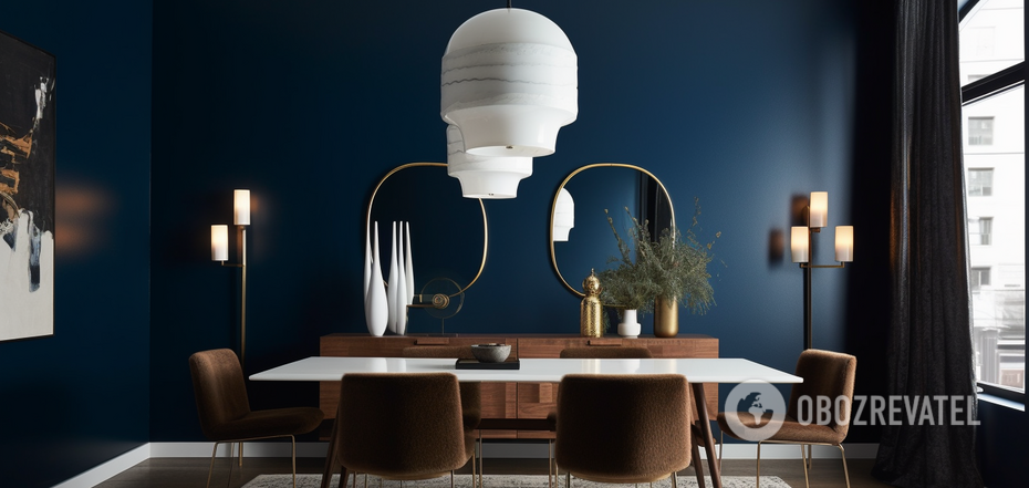
Blue and mental state
The color blue affects our state of mind and creativity. Its main effect is to get the brain working. But the reaction to it can be both positive and negative. A wrongly chosen shade can cause a feeling of alienation and disinterest in life. Before it is important to avoid it in the dining room, particularly because of the unconscious reaction to blue food as spoiled and dangerous. This color also suppresses the appetite.
How to play with blue in the interior? Where it belongs is in the work or study area. It will help to keep concentration and awareness at work, will have a good effect on creativity and memory.
Psychological side effects of gray
Gray is considered a neutral color not only in terms of colorism, but also in terms of emotional impact. But quite a large part of people it can make them feel depressed, tired, cause a desire to hide from the world. However, this also accounts for its popularity - shades of gray in the interior choose people who want to slow down at home, stop the frantic movement of events of the modern world, to minimize stun and confusion, to organize chaotic space.
How to play gray in the interior? Depending on the tones and depth of color, gray can combine with almost any other shade. It serves as an excellent background for a variety of bright accents. And it can be used to add depth to the space of the room. Just choose a shade that soothes rather than depresses you.
Consequences of abusing saturated colors
The saturation - chromatic intensity - of a color can make a room unhappy just as much as using any of the specific colors mentioned above. The deeper the hue, the more it will affect emotions. Conversely, more airy color options will leave more room for natural reactions and be calming. For example, a darker and more intense blue color stimulates mental activity, while a lighter and lighter shade can be calming and induce peacefulness. And a dark red is physically invigorating, while a soft light red is physically relaxing. The depth of yellow determines the strength of its emotional effect - gentle pastel variations can evoke memories of happier times and warm sunny days.
When using color to change behavior, it's important to consider both positive and negative associations with each color. Remember that not everyone sees or feels color the same way. Using the right tone in the right proportion and in the right place is paramount if you want to create the desired effect.
Earlier OBOZREVATEL told what colors allow you to make the interior more expensive and more luxurious.
Subscribe to OBOZREVATEL channels in Telegram and Viber to keep up to date.
Other News


They are back on their honeymoon: Meghan Markle tells how she made Prince Harry fall in love with her again after seven years of marriage
The spark has not yet faded between the spouses

"There is no such thing as overweight": Yevhen Klopotenko describes the ideal woman for him and explains why he doesn't pay attention to appearance
Personal traits of a partner are important for a restaurateur


Rock legend Neil Young has announced a free concert in Ukraine
Negotiations on the organization of the concert are underway

He promised a "fee" for destroyed tanks of the Armed Forces of Ukraine: Grigory Leps received a suspicion from the SSU in absentia
In 2023, the artist traveled to occupied Donetsk