Life

Light and soothing shades are ideal


There is a link between the colour of the bedroom walls and the quality of sleep. According to a study published in the National Library of Medicine, bedroom colours can affect mood and even provoke insomnia.
For a rest room, it is better to choose shades that are associated with calmness and relaxation. The Sante Plus publication has told us what colours should not be used in the bedroom.
Does bedroom colour affect sleep?
The answer is yes. Colours affect mood, emotions and behaviour. According to Suzy Chiazzari, a chromatherapy and holistic design consultant, your bedroom decor has a huge impact on the quality and duration of your sleep. Chromotherapy is a method that aims to project flashes of colour onto the body for physical, mental, and emotional harmonisation. As a rule, soft colours in bedrooms are more suitable for sleeping than bright shades.
Favourable colours for the bedroom
The best colours for sleeping are those that make you feel happy and relaxed. Here is a selection of the most calming colours that you can add to your sleeping area.
Blue is a calming colour
The colour of the sky and the sea has long been considered soothing. Blue shades promote calmness, serenity and confidence. According to a study by Travelodge, blue is the best colour for the bedroom.
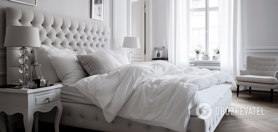
Classic white
White, the colour of peace and tranquility, is also ideal for the bedroom. Moreover, white is in harmony with all shades, so you can create a great stylish interior.
Light pink - a warm and modern colour
Light shades of pink represent tenderness. It is a very calming colour. If you lead a busy lifestyle, pale pink is an ideal choice for the bedroom. It is not necessary to paint the walls pink, you can use a blanket or pillows of this colour.
Perfect green
Green is a symbol of nature that has an incomparable calming effect. It is associated with harmony, comfort and tranquillity. It is worth choosing natural green and avoiding bright and acidic shades.
Neutral beige
Due to its light and neutral shade, beige remains an attractive option for any interior. It represents simplicity and calmness.
What colours are better not to use
Red
Red is one of the most energetic colours. It is an aggressive, intense and belligerent colour that is hardly suitable for the bedroom. Red symbolises danger, war and power, as well as passion. A very intense colour can even cause aggression or anger.
Dark purple
Purple is associated with creativity, strength and extravagance. However, experts say that a purple bedroom will promote vivid dreams and nightmares. As a result, you will feel constantly tired.
Orange
Orange, like red, is too saturated to use in the bedroom. It is definitely not worth painting the walls orange, but as individual decorative elements (carpets, figurines, books), it will not have a negative impact.
Dark brown
Dark brown is too dark a colour for a good night's sleep. According to a study by Travelodge, people who sleep in a brown room are more likely to suffer from insomnia. Dark brown symbolises despondency, anxiety, loneliness and depression.
Black
Black is quite popular among interior designers, but it is better to avoid it in the bedroom. Black attracts negativity, fear, anxiety and insomnia.
Earlier, OBOZREVATEL told what indoor flowers are suitable for the bedroom and what should not be placed by the bed.
Subscribe to OBOZREVATEL's Telegram and Viber channels to keep up with the latest news.
Other News


"There is no such thing as overweight": Yevhen Klopotenko describes the ideal woman for him and explains why he doesn't pay attention to appearance
Personal traits of a partner are important for a restaurateur

"Can't get it out of my head": Polish representative at the Eurovision Song Contest 2025 praises Ukraine's song
Ukraine will be represented by the band Ziferblat


He promised a "fee" for destroyed tanks of the Armed Forces of Ukraine: Grigory Leps received a suspicion from the SSU in absentia
In 2023, the artist traveled to occupied Donetsk

Revenge that has been waiting for 22 years: Halle Berry passionately kissed Adrien Brody on the red carpet in front of his wife. Video
The wife calmly reacted to the unexpected moment