Life


4 colours to avoid in a look after 40


When it comes to the idea that years take away beauty and "freshness", everything in the image is analysed - from the style to the cut of individual wardrobe items. And for good reason, because even such a small thing as a bad colour can spoil your appearance and visually add years.
The experts of Dea Vita gloss told us which shades are best avoided after 40 years. Only 4 rules will help you avoid trouble (to see the photo, scroll to the bottom of the page).
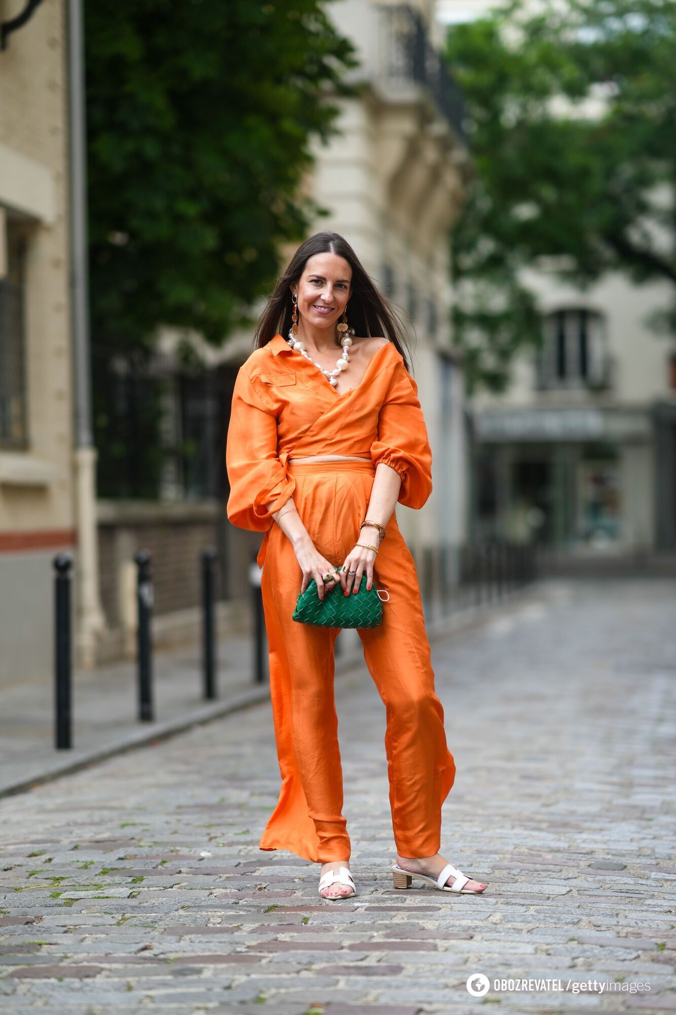
Orange
Although there is a theory that bright colours are associated with youth, this is not always the case. In particular, deep orange accentuates wrinkles and visually makes the face look dull.
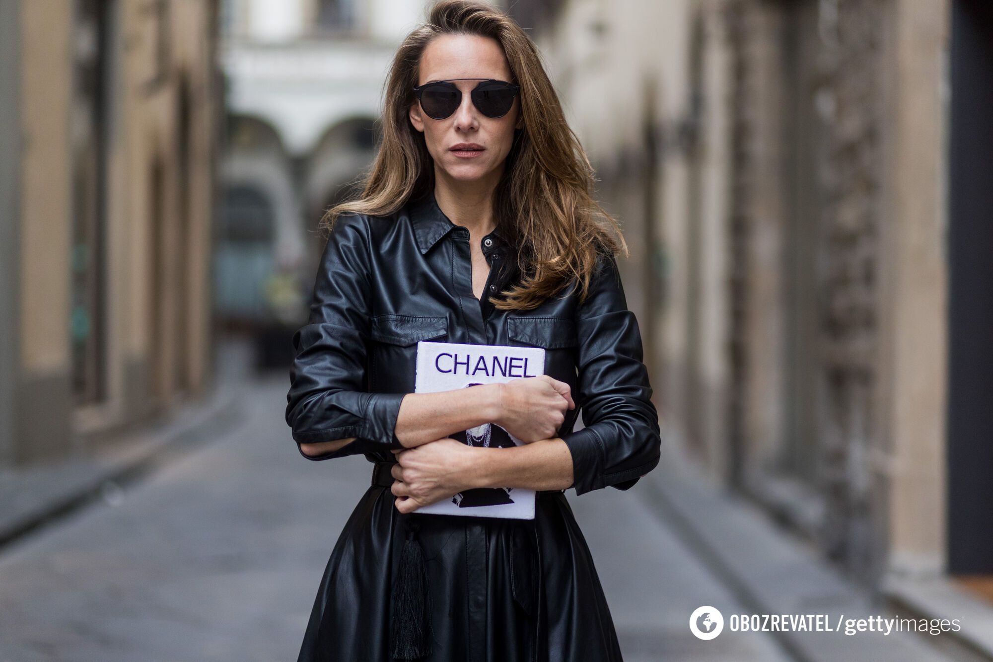
Black
Seemingly perfect for all occasions, total black loses its relevance when it comes to looking fresh over 40. A monochrome black outfit will emphasise skin imperfections and add fatigue, but a few accessories, a blouse, shoes or a jacket will fix this situation.
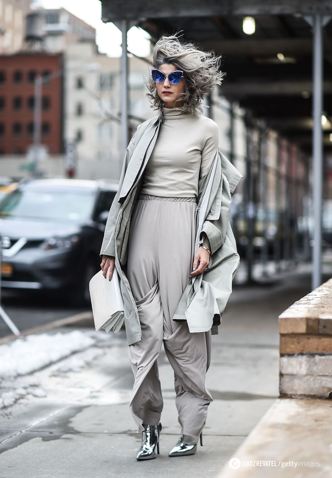
Grey
Grey should not be the main shade of the look if you want to create a rested and cheerful look. It is better to add it in a dosed manner - in accessories, as neutral grey can make the skin look pale.
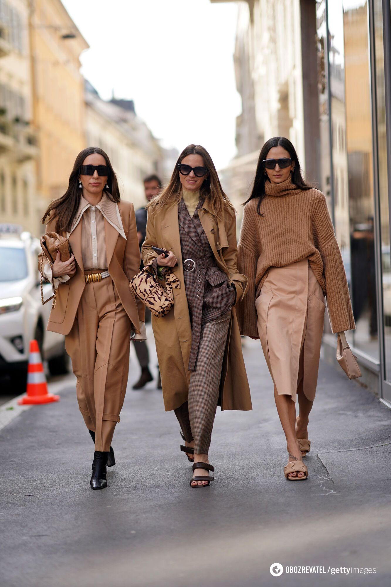
Pastels
A set of pastel colours in an outfit without adding contrasting elements may seem basic and simple, but after 40, it is better to rely on bright details. This way, your clothes won't look boring.
Earlier, OBOZREVATEL wrote about how to look younger with your hairstyle. Celebrity stylists gave some tips.
Only verified information is available in our Obozrevatel Telegram channel and Viber. Do not fall for fakes!
Other News


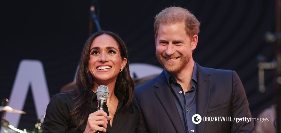
They are back on their honeymoon: Meghan Markle tells how she made Prince Harry fall in love with her again after seven years of marriage
The spark has not yet faded between the spouses

"There is no such thing as overweight": Yevhen Klopotenko describes the ideal woman for him and explains why he doesn't pay attention to appearance
Personal traits of a partner are important for a restaurateur


Rock legend Neil Young has announced a free concert in Ukraine
Negotiations on the organization of the concert are underway

He promised a "fee" for destroyed tanks of the Armed Forces of Ukraine: Grigory Leps received a suspicion from the SSU in absentia
In 2023, the artist traveled to occupied Donetsk