Life

Colours in clothes that cannot be combined


We are used to seeing such bold decisions from designers at fashion shows that it seems that the more crazy the look, the more trendy it is. Indeed, the most important fashion trend over the past few years is the lack of rules and canons. However, there are rules that you still have to follow to make your appearance harmonious. For example, you need to consider which shades in your clothes go well with each other and which do not.
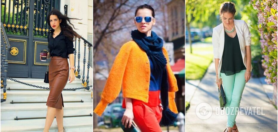
OBOZREVATEL has decided to tell you about five colour combinations that are best avoided when putting together a look. No matter how stylish things are individually, if their palette does not match each other, the look will unfortunately be a failure.
Bright green and carrot (red, orange)
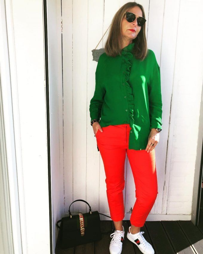
If you don't want to look like Santa's helper, then avoid such a bright combination. Green and carrot are contrasting shades that together create a harsh and not very pleasing combination. If you have clothes in such colours in your wardrobe, wear them with more neutral "calm" shades.
Brown, grey and black
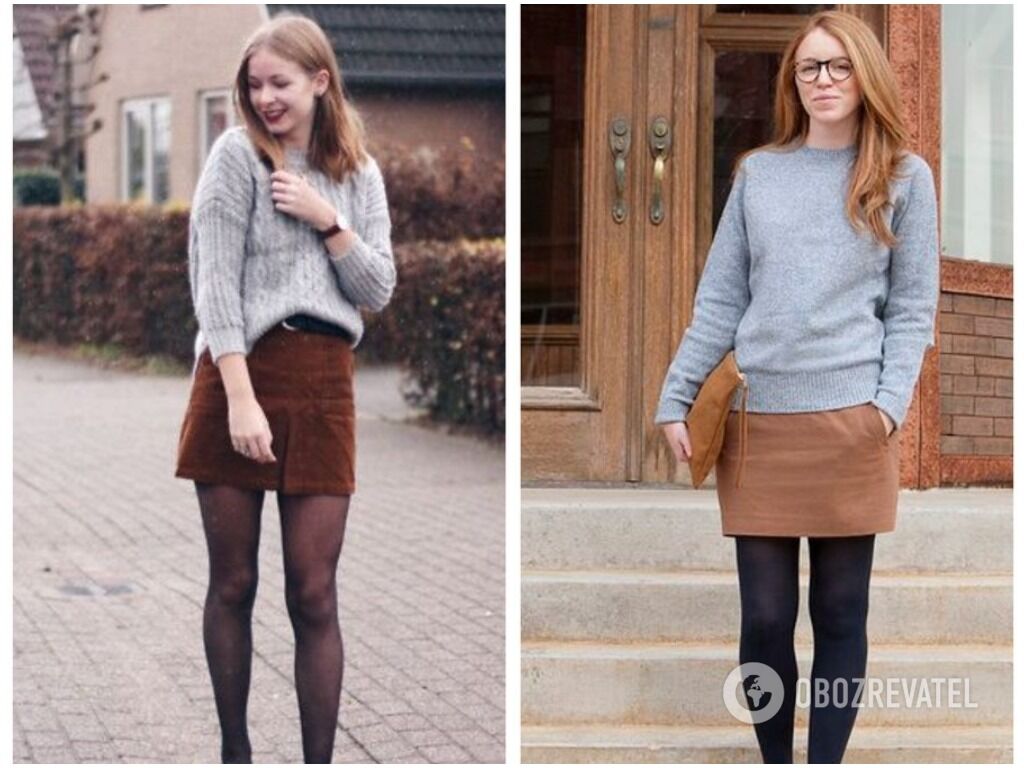
We dare to assume that you have the most clothes in these colours in your closet, which is why you often wear three of them at once. However, the combination of black, brown and grey looks a bit dirty and too gloomy. They should be diluted with more airy shades: white, milk, beige, plum.
Yellow and bright purple

The deep purple colour is very unusual and pleasing to the eye, but at the same time it is one of the most difficult to combine with other colours. It is especially unfriendly to yellow. Together, they look cheap and tasteless. We advise you to combine bright purple with pastel, sandy tones or its paler variants: lavender, powder and others.
Mint/lime green and black
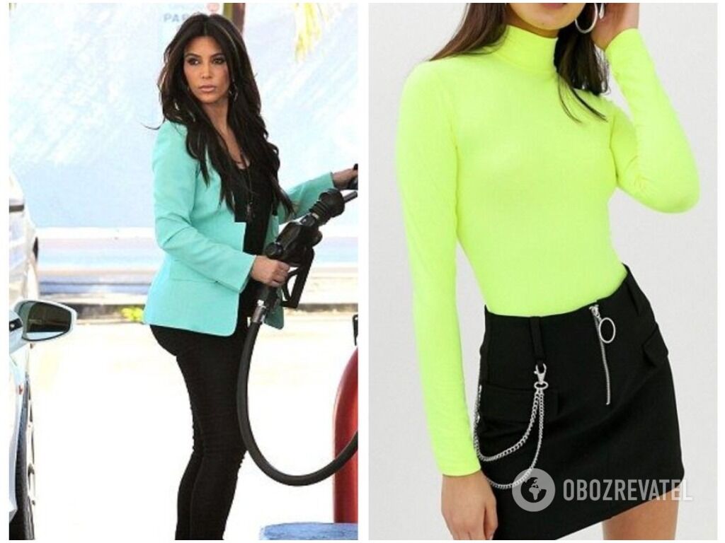
Although black is considered the most basic of all the basic colours, it is almost impossible to combine it with bright colours. It cheapens the rainbow palette - it doesn't get along well with red and fuchsia, orange and yellow, but especially badly with mint and light green. Sets in this colour scheme look inharmonious, too contrasting and emotionally heavy.
Lilac and green
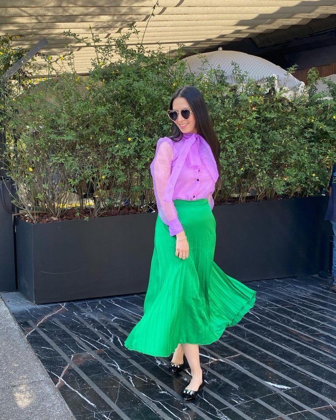
These shades compete as if they are trying to eat each other. As a result, the charm of each of them is lost, although individually they look quite noble and elegant.
Earlier, OBOZREVATEL wrote about unforgivable mistakes in the selection of clothes that reek of cheapness. Such looks or their unsuccessful elements will age you and make you look fat. You can find all the details at the link here.
Only verified information is available in our Obozrevatel Telegram channel and Viber. Do not fall for fakes!
Other News


They are back on their honeymoon: Meghan Markle tells how she made Prince Harry fall in love with her again after seven years of marriage
The spark has not yet faded between the spouses

"There is no such thing as overweight": Yevhen Klopotenko describes the ideal woman for him and explains why he doesn't pay attention to appearance
Personal traits of a partner are important for a restaurateur


Rock legend Neil Young has announced a free concert in Ukraine
Negotiations on the organization of the concert are underway

He promised a "fee" for destroyed tanks of the Armed Forces of Ukraine: Grigory Leps received a suspicion from the SSU in absentia
In 2023, the artist traveled to occupied Donetsk