Life
Russia is much smaller? Scientists showed the real map of the world and explained the distortions
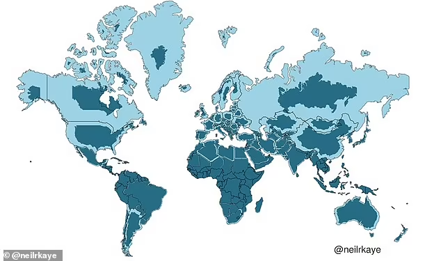
The map of the world that we are all familiar with suggests that Greenland and Africa are similar in size. But if you check the encyclopedic data on their area, it turns out that the southern continent is 14 times larger. Including offshore islands, Greenland's total area is 2.16 million square kilometers, while the vastness of Africa covers 30.4 million square kilometers. Moreover, the continent is three times larger than North America and significantly larger than Russia, although on the map they look comparable.
As reported by the Daily Mail, this distortion is a consequence of the Mercator projection. This is what has caused many countries, including Canada, Greenland, and Russia, to be depicted as much larger than they really are. To see the image-comparison, scroll to the end of the news.
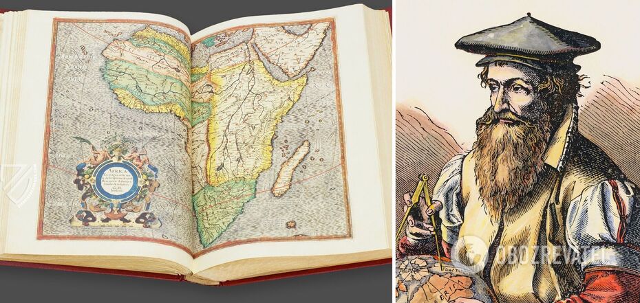
This projection was first used in 1569 by the Flemish scientist Gerard Mercator (1512-1594) to create a navigational chart of the world. It was supposed to help sailors navigate in relation to their position. His projection does not distort angles and shapes, but is quite liberal with distances and dimensions. At the same time, the cartographer depicted the rich countries of the northern hemisphere much larger than their actual size.
According to this mapping approach, Canada and Russia, for example, occupy about 25% of the Earth's surface on the world map. While in reality they account for only 5%. Nor does Australia seem much larger than Alaska, even though it is the sixth-largest country in the world, and in fact it is 4.5 times the size of the northern U.S. state.
The need for such a projection arose because of one of the main problems of cartography - the inability to depict the real proportions of a spherical globe on a flat surface. Ancient cartographers struggled with this, creating images of various shapes - from a heart to a cone.
Mercator's elaboration turned out to be much more convenient than anything created before. But it gave and still gives a wrong idea of the proportions of the world. Neil Kaye, a climate data specialist at the British Bureau of Meteorology, decided to show the correct parameters. He developed his two-dimensional image of the world, closer to reality. In particular, the countries of the northern hemisphere look much smaller on it than we are used to from traditional maps.
Kaye took Meteobureau data about the size of each country for his map and put it into Ggplot, a data visualization package for statistical programming. From this, he created the final map using sterographic projection, a mapping function that projects an area onto a plane.
The problem with Mercator's map arose in part because the scientist himself had not traveled much, even when compared to his colleagues. The Flemish scholar's source of geographic knowledge was a library of more than a thousand books and maps. In the 1580s he began publishing his atlas, a collection of maps that he named after the titan who, in Greek mythology, holds the world on his shoulders.
In Mercator's projection, North America looks at least as large, if not slightly larger than Africa. Greenland, too, is visually comparable in size, though in fact Africa is larger than both. The map also assumes that the Scandinavian countries are larger than India, when in fact the latter is three times larger than all of them combined.
Earlier OBOZREVATEL published NASA video, which shows a real view of the Earth from space and shows many natural phenomena from an unusual perspective.
Subscribe to the channels of OBOZREVATEL in Telegram and Viber to keep up with the latest events.


